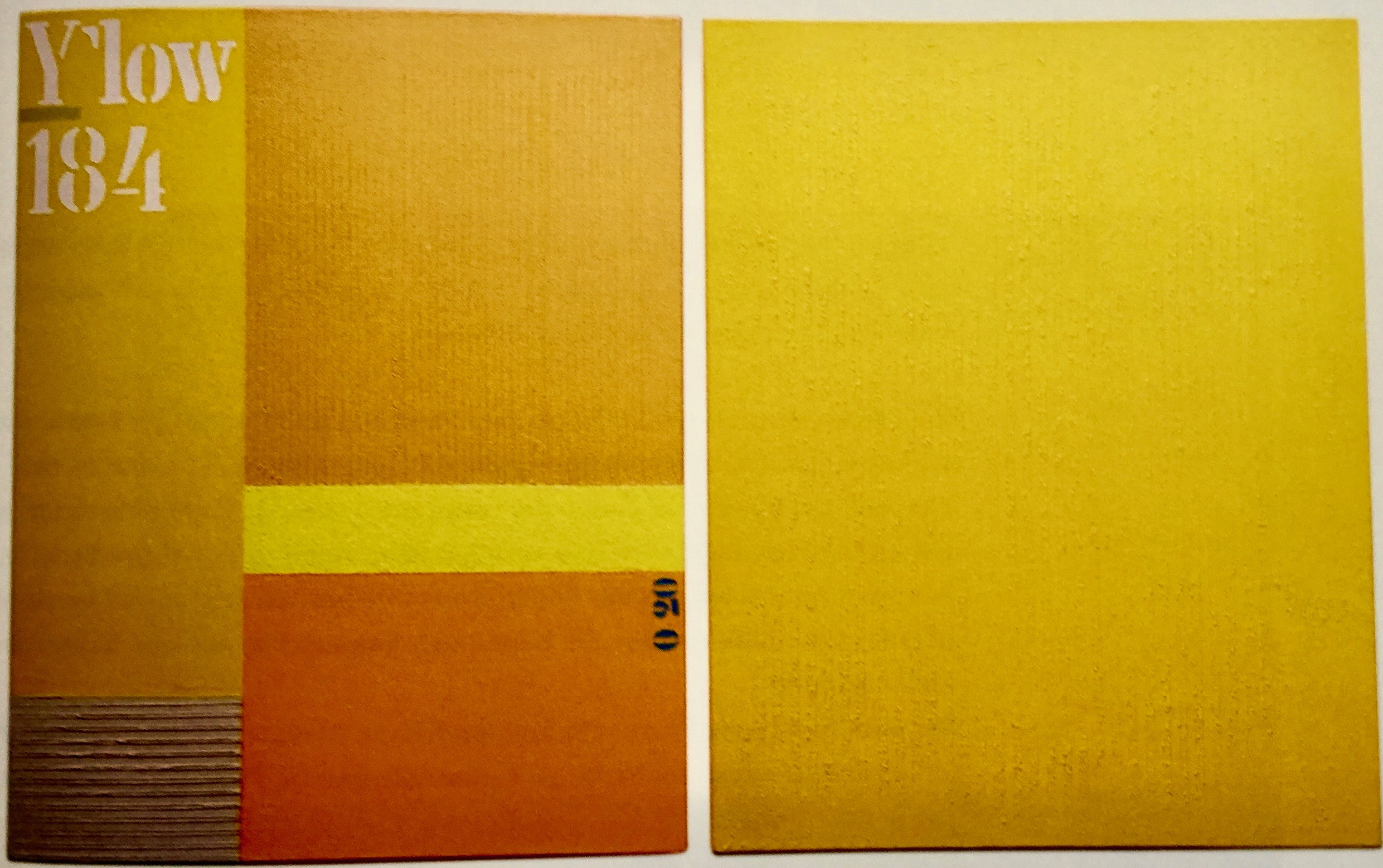
Yellow 184, Öl auf Leinwand. Kunstausstellung Museum für konkrete Kunst Ingolstadt
Ausstellung konkrete Kunst im Museum für konkrete Kunst Ingolstadt
Kunstausstellung Museum für konkrete Kunst Ingolstadt. Kunstsammlung Museum für konkrete Kunst Ingolstadt.
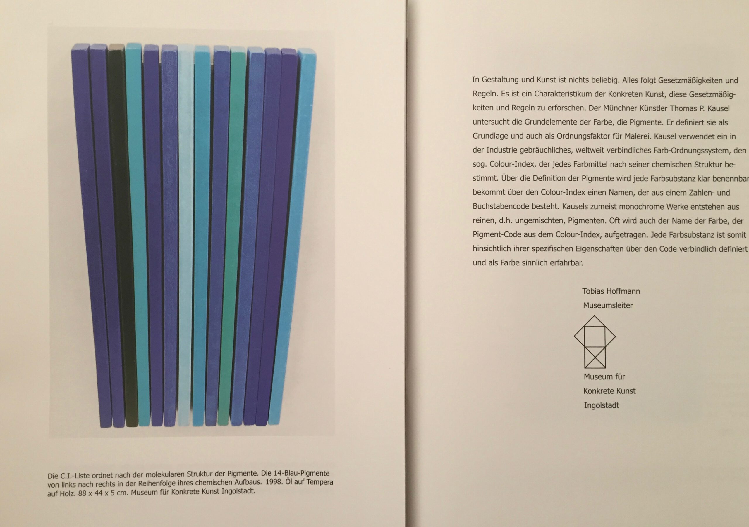
Geordnete Farben. Konkrete Malerei. Museum für konkrete Kunst Ingolstadt. Katalog.
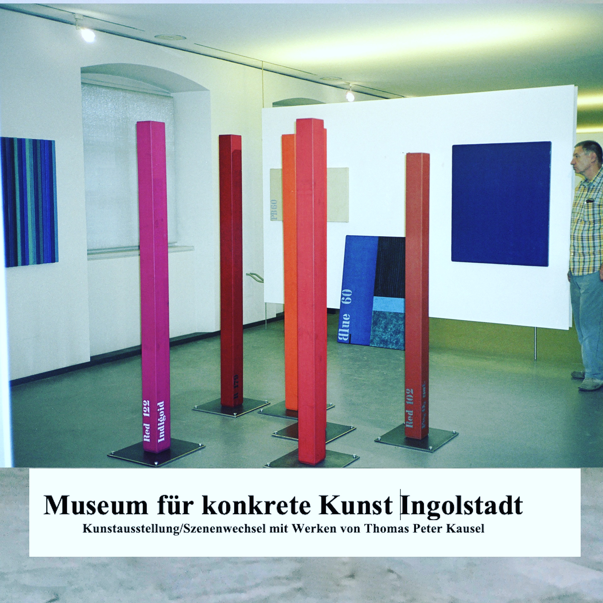
Museum für Konkrete Kunst Ingolstadt.Ausstellung mit Werken von Thomas Peter Kausel
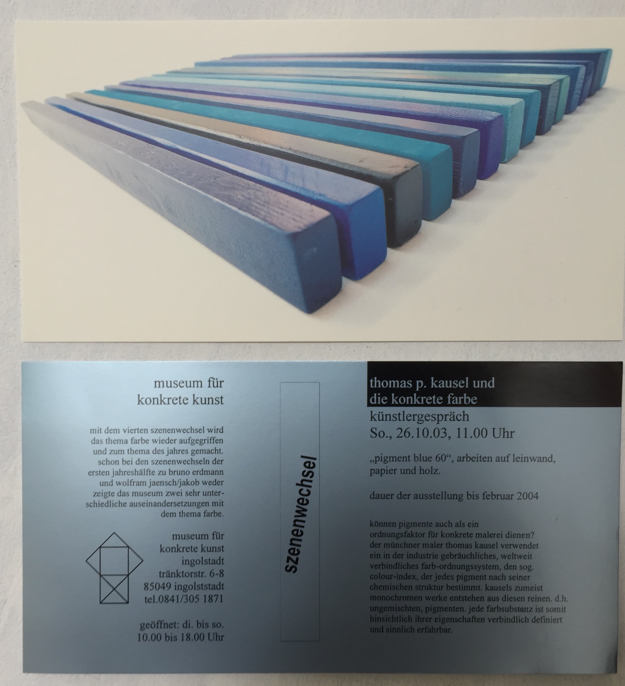
Museum für Konkrete Kunst Ingolstadt.Ausstellung mit Werken von Thomas Peter Kausel. Künstlergespräch.
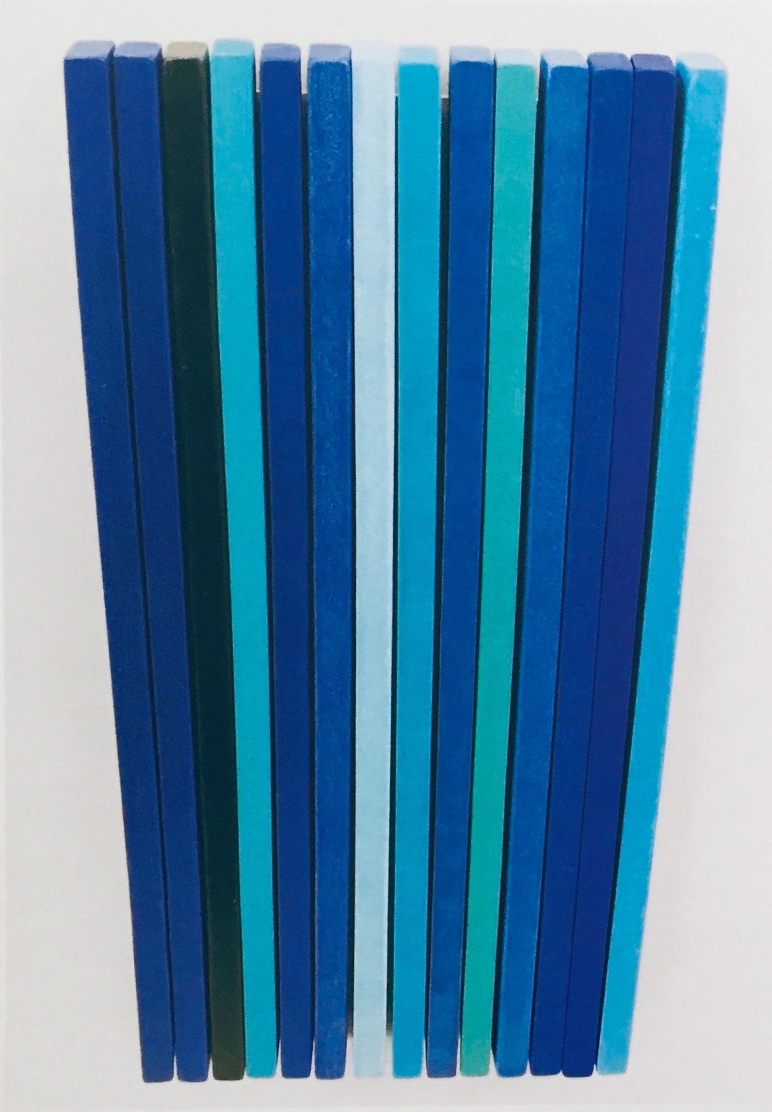
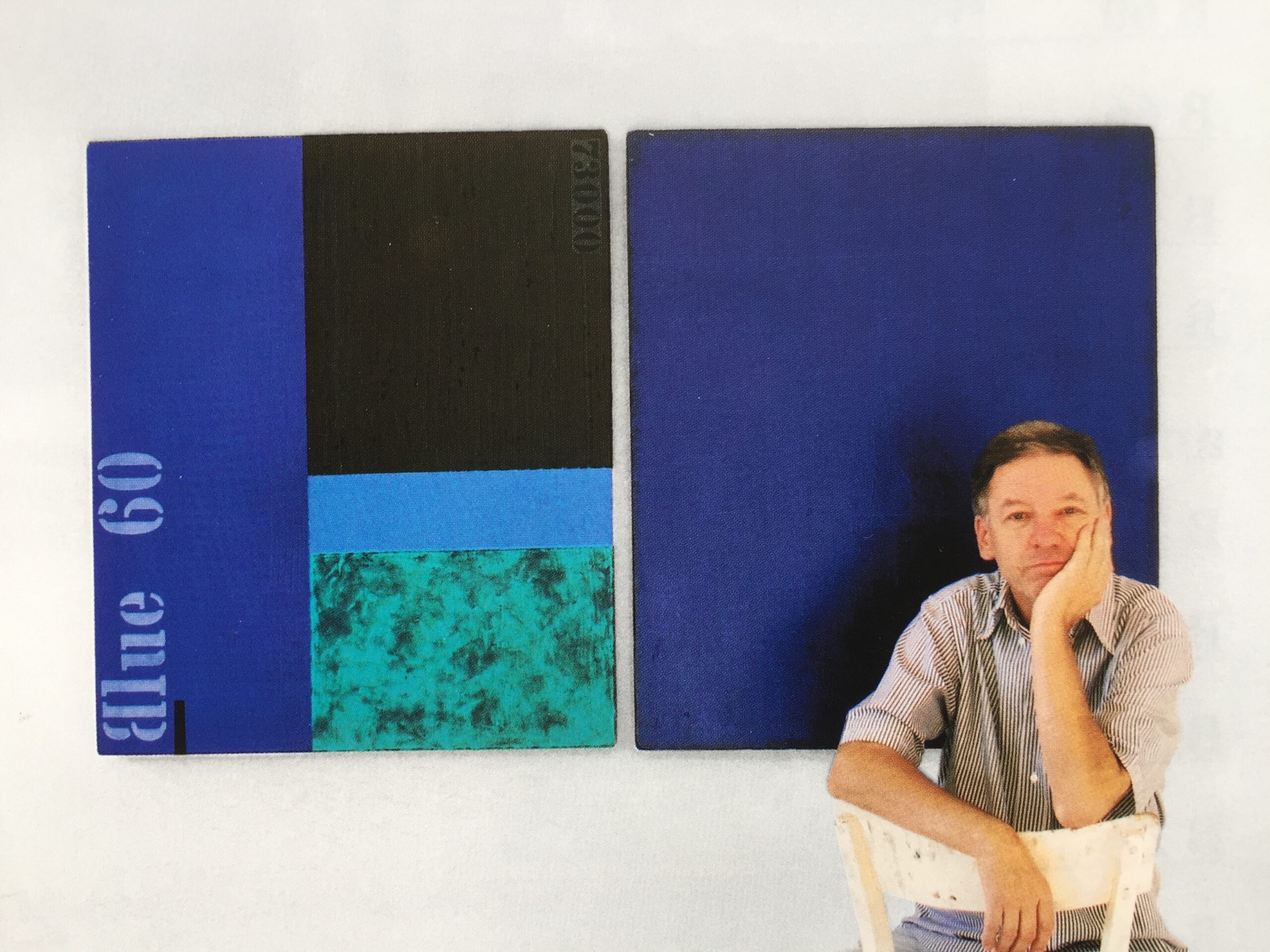
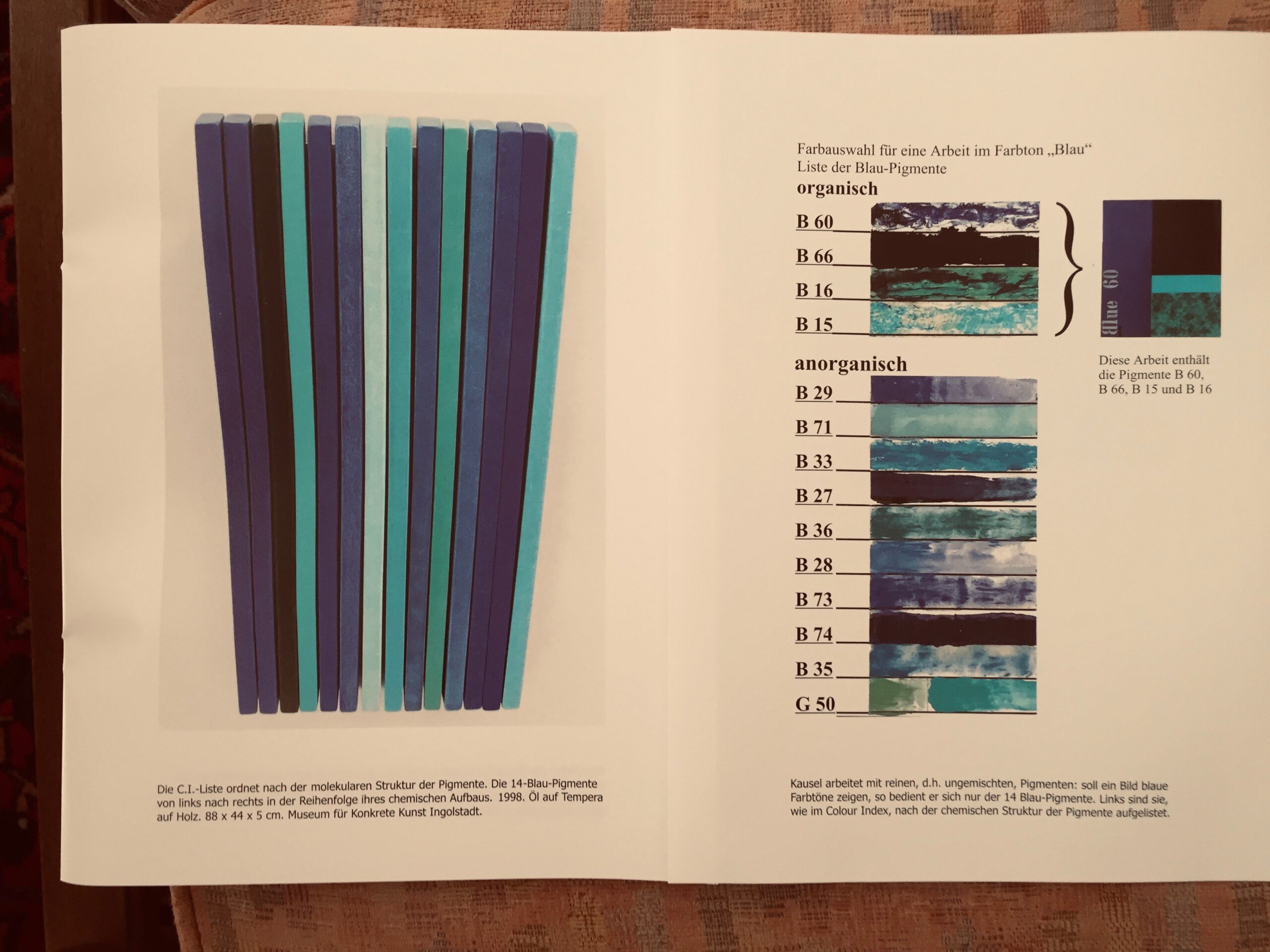
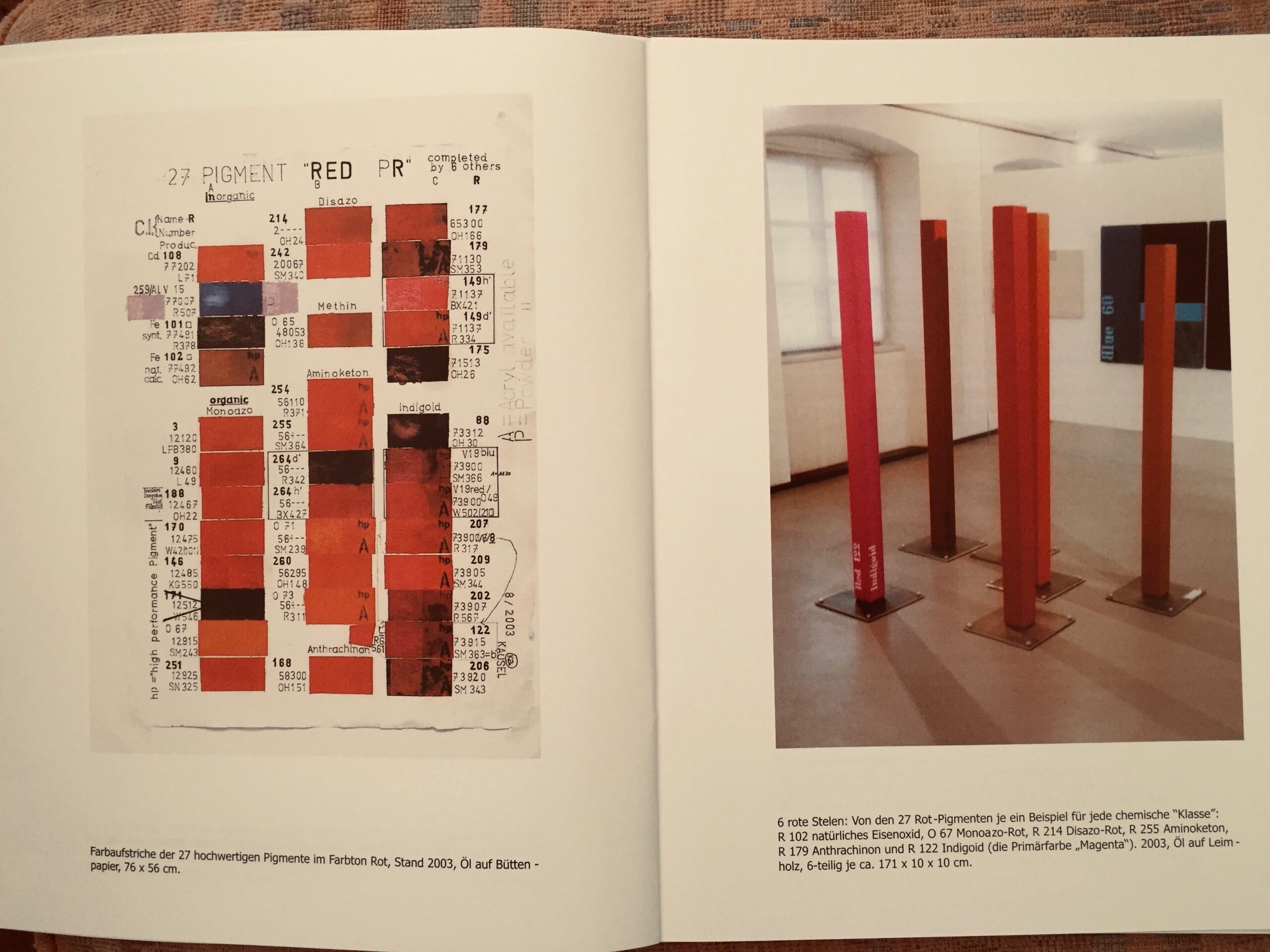
Kunstsammlung „14 Blau“ von Thomas Peter Kausel im Museum für konkrete Kunst Ingolstadt
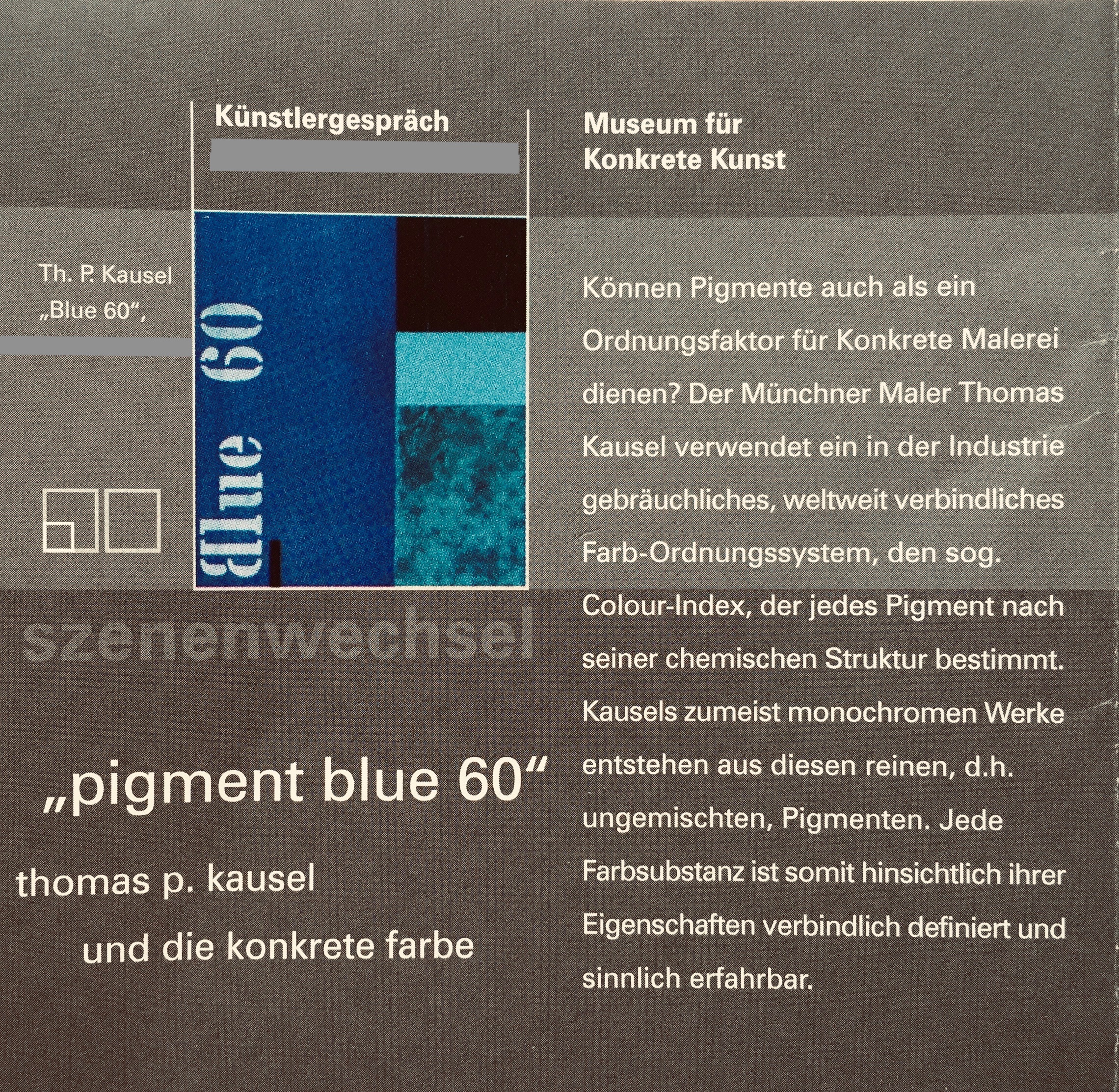
Museum für konkrete kunst Ingolstadt, Künstlergespräch
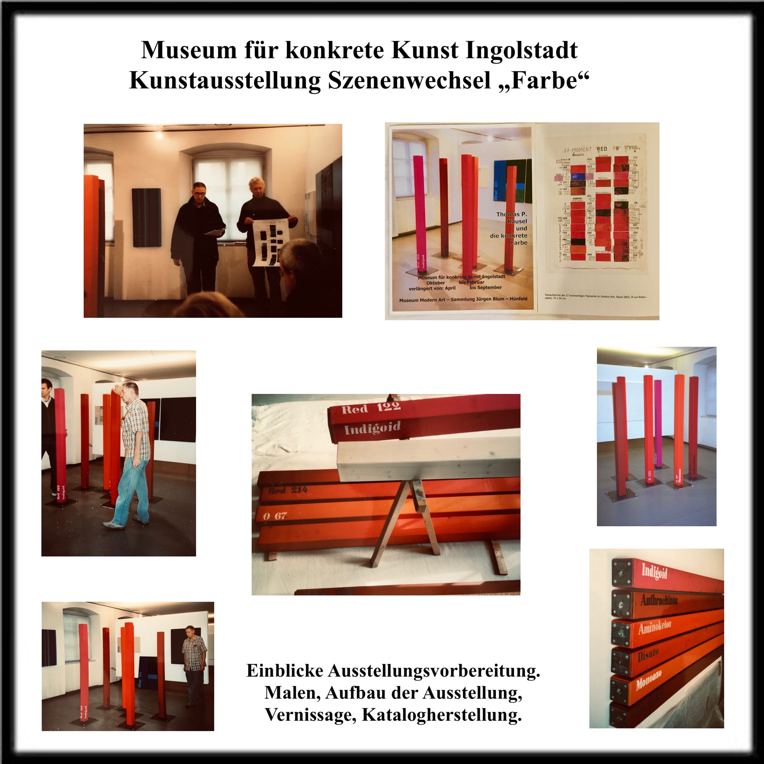
Museum für konkrete kunst. Ausstellungsaufbau Kunstausstellung
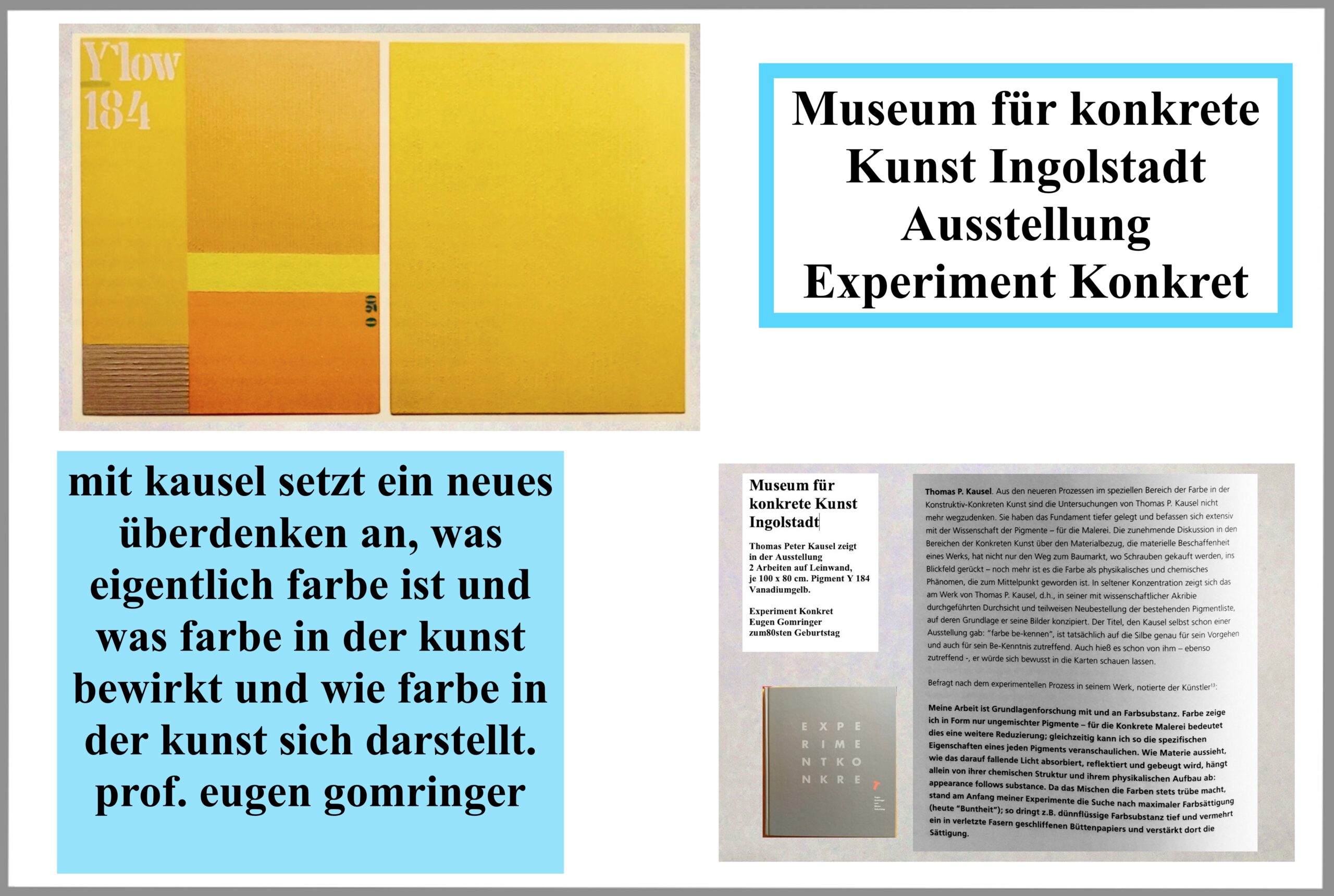
Museum für konkrete Kunst Ingolstadt. Ausstellung Experiment : konkret
Kunstsammlung für konkrete Kunst Museum für konkrete Kunst Ingolstadt
Museum für konkrete Kunst Ingolstadt, Kunstausstellung